Responsive Web Design Fundamentals
Course Description
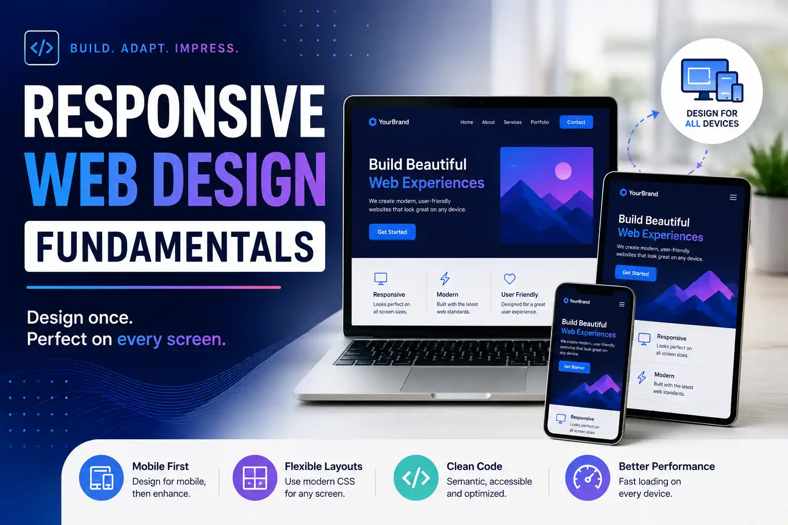
In today's multi‑device world, your website must look great on every screen,from phones to tablets to desktops. This free course, made in partnership with Google's Pete LePage, teaches you the fundamentals of responsive web design so you can build sites that adapt beautifully to any device.
You'll start by exploring what makes a site responsive and learn common responsive design patterns. From there, you'll dive into creating your own responsive layouts using the viewport tag and CSS media queries. You'll also experiment with major and minor breakpoints and optimize text for reading.
This free, self-paced course consists of 5 lessons and requires no prior technical experience. It's ideal for beginners who want to master the art of building websites that work everywhere.
Course Provider
Provider: Udacity, a global online learning platform offering Nanodegree programs and free courses in technology and design.
Platform: Udacity online platform – fully online, self‑paced.
Instructors: Pete LePage (Developer Advocate at Google) and Cameron Pittman (Software Engineer at Jacobs).
Course Syllabus (5 Lessons)
Learning Objectives
- Understand the principles of responsive web design and why it matters.
- Use the viewport tag to control layout on mobile devices.
- Write CSS media queries to adapt your site to different screen sizes.
- Identify and apply major and minor breakpoints.
- Optimize text and images for better readability on any device.
- Build a fully responsive website from scratch.
Course Prerequisites
Technical: No prior technical experience is required. You will need to be able to communicate fluently and professionally in written and spoken English.
Recommended: Basic knowledge of HTML (the course includes some HTML, but you can learn as you go).
Who should take this: Aspiring web developers, designers, and anyone who wants to build websites that work on every device.
User Reviews
"cool online course"
"awesome!!!"
"EXCELLENT AND USEFULL NEVER SAW A COURSE LIKE THIS IN MY LIFE"
Based on 54+ ratings on Udacity.
💡 Final Thoughts
This free course from Udacity is the perfect starting point for anyone who wants to build websites that work on every device. With expert instruction from Google's Pete LePage, you'll learn the core concepts of responsive design,viewport, media queries, breakpoints,and practice them hands‑on. The course is short, practical, and requires no prior experience. The certificate is a great credential to showcase your new skills. Whether you're a developer, designer, or just getting started with web development, this course will give you the confidence to create sites that shine on any screen.
Responsive Web Design Fundamentals – FAQ
Is this course really free?
Yes, completely free. Udacity offers this course at no cost. You just need to create a free account on the platform.
Do I need any prior experience?
No prior technical experience is required. Basic knowledge of HTML is helpful but not necessary.
How long does the course take?
The course consists of 5 lessons and is self‑paced. Most learners complete it in a few hours.
Will I receive a certificate or badge?
Yes, upon completing the course, you'll receive a certificate of completion from Udacity. You can share it on LinkedIn and other platforms.
Who are the instructors?
The course is taught by Pete LePage (Developer Advocate at Google) and Cameron Pittman (Software Engineer at Jacobs).
What will I learn?
You'll learn the fundamentals of responsive web design: viewport tag, CSS media queries, breakpoints, and optimizing text for reading.